

The good stuff
The mood boards and final outcomes conveying Carita's feel-good, warm, and modern stance towards fundraising, bonding, and creating a larger impact for causes you love —together.
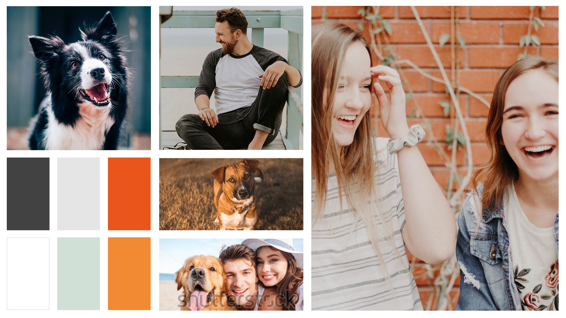


Mood boards
Mood boards were curated and presented to give a look and feel with which the Carita team could work. Photography and themes harmonized around Carita's voice and palette to create a consistent visual story of warmth, openness, and a socially conscious, forward-thinking atmosphere.
Additionally, bold typography examples were chosen as they enable viewers to directly connect with a conveyed story, especially when paired with imagery. This modern trend would help Carita come across as fresh, new, and bold.


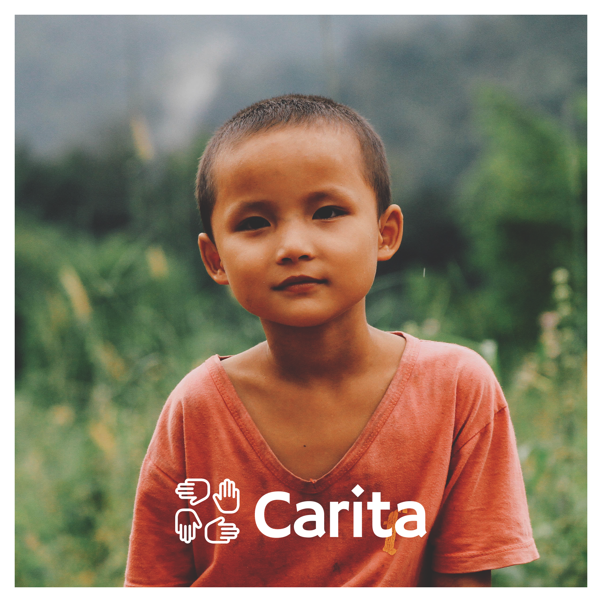
Working Sample no.1
After curating multiple possible directions for Carita, the team ended up going with the above direction as we felt it was direct, simple, yet impactful. This look and feel is versatile and could be applied to multiple different dimensions and layouts.
By including the three drafts from the sample together, I demonstrated how the addition of peach and mint to the Carita color palette could work together in our overall campaign.


social tiles
A few examples of how the working sample was applied to Carita's social media.
presentation notes and design thinking
I curated a presentation to help walk the Carita team through my design thinking, and the reasoning behind the choices for possible visual routes.

target audience
It was beneficial to restate and solidify the target audience that Carita had set forth to demonstrate how our look and feel would relate with potential users.

necessities of advertising
I included a very brief overview of traits our previous advertising required to boost results to desired standings.

Carita's Voice
As a team, we brainstormed a few buzzwords and traits Carita, as a brand, should uphold in everything we generate, and all of our interactions. It was beneficial to include these buzzwords are part of my design thinking.

color
A color overview slide of the differences between digital and print advertising was included to showcase how our current color palette of orange and neutrals would differ between physical and digital spaces.
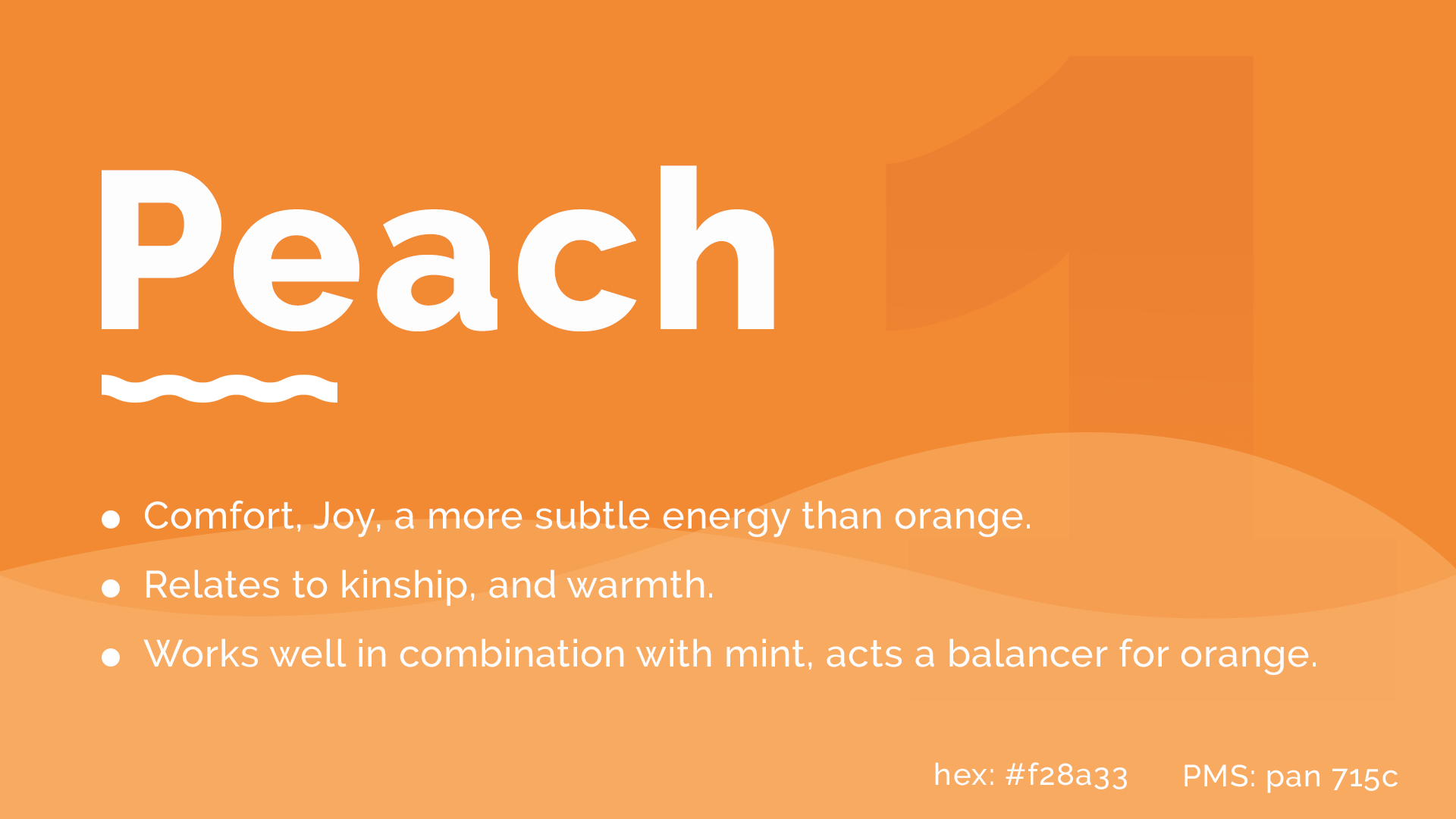

Color Additions
Additionally, I included the two new secondary colors, peach and mint, to work together with Carita's orange and neutrals: bringing more liveliness to the palette, as well as helping to spark visual diversity that would still work within the larger framework of our overall scheme and brand voice.